
If you're running an online store with WooCommerce, you know how important the checkout page is. It's where customers finalize their purchases, so making it user-friendly can really boost your sales. In this guide, we'll walk you through the steps on how to edit the checkout page in WooCommerce, helping you create a smoother experience that can lead to more conversions.
Key Takeaways
- Understand the importance of the checkout page in driving sales.
- Learn how to customize checkout fields using WooCommerce settings and plugins.
- Simplify the checkout process to reduce cart abandonment.
- Enhance user experience with mobile-friendly designs and clear CTAs.
- Regularly optimize your checkout page based on customer feedback and analytics.
Understanding The WooCommerce Checkout Page
What Is The Checkout Page?
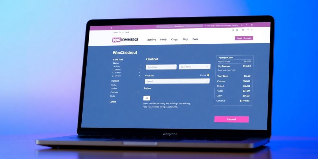
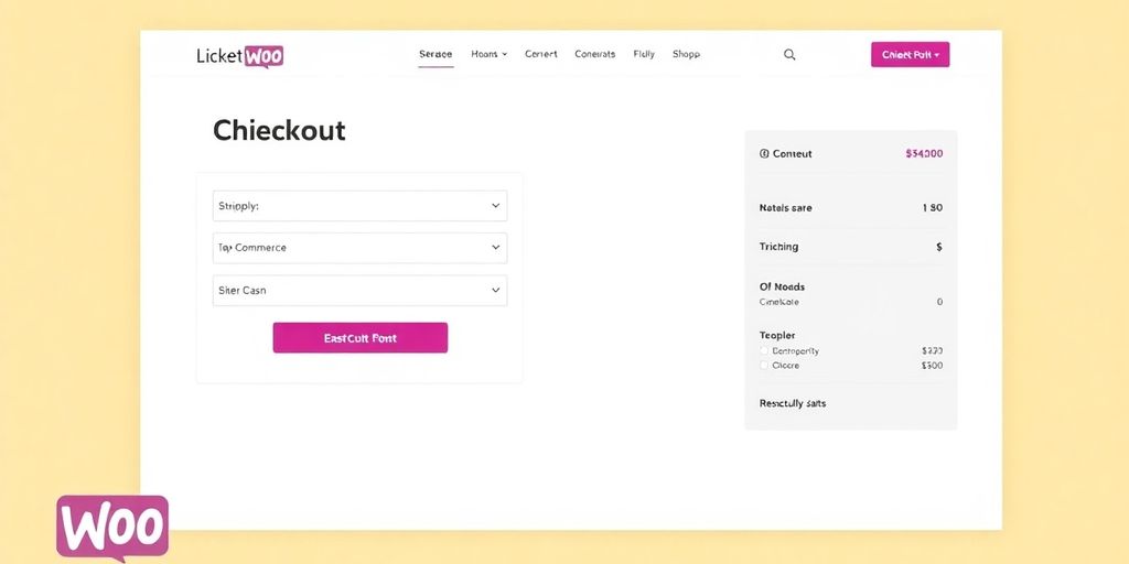
The WooCommerce checkout page is where you wrap up the buying process. It ties together details like shipping and billing info and payment options. This is the point where a customer decides to complete their order. Keep this page clear to avoid any confusion during checkout. It acts as the final step before a purchase is confirmed. You might even find that a custom checkout setup can offer extra convenience.
Why It Matters For Your Store
This page can make or break a sale. If it feels clunky or confusing, people might give up halfway through their purchase. Remember, a smooth checkout can:
- Build customer trust
- Lower the rate of abandoned carts
- Speed up the buying process
The overall experience here influences how customers feel about your store. A user-friendly checkout can be the difference between a sale and a missed chance.
Key Elements To Consider
When you look at your checkout page, keep an eye on a few core areas:
- Address fields: They should be easy to fill out and not too many if the product is digital.
- Payment methods: Offer options that your customers actually use, making it quicker for them to choose.
- Order summary: Everything should be reviewed at a glance so that errors can be minimized.
Below is a simple table to show a common layout for a checkout page:
A well-organized checkout page makes it easier for people to complete their purchase, reducing hesitation and confusion.
Customizing Your Checkout Fields
When it comes to tweaking your checkout fields, you've got a few solid paths you can take. This section walks you through using the default WooCommerce settings, adding custom fields with plugins, and even fine-tuning with CSS adjustments.
Using Built-In WooCommerce Settings
Start with the basics. WooCommerce supplies built-in settings that let you adjust fields without extra code or plugins. You can:
- Reorder fields easily by dragging and dropping them.
- Switch on or off specific fields using checkboxes.
- Reset everything back to the default if you mess up your setup.
This method is straightforward and great for those who prefer a no-fuss approach. It's perfect for quick changes and basic tweaks. If you're curious, check out the section on custom checkout fields for more insights on what these tweaks can do for your store.
Remember, using built-in settings is the quickest way to see changes without a steep learning curve. It gives you immediate results without having to dive into code.
Adding Custom Fields With Plugins
If you need more flexibility, adding fields with plugins might be your best bet. Tools like the Checkout Field Editor give you the ability to introduce entirely new elements on your checkout page. This method is handy if you want extra customer info or special options tailored to your business.
Here’s a short step-by-step list to help you out:
- Install a checkout field plugin from your dashboard.
- Activate the plugin and navigate to its settings page.
- Create your custom fields, adjust labels, and decide which ones are mandatory.
Once you've configured everything, test the checkout process to ensure it behaves as expected. By adding fields this way, your checkout becomes uniquely yours. For more technical details, you might want to review our tips on custom checkout fields.
Editing Fields With CSS
Even after setting up your desired fields, a final polish can come with some custom CSS. This lets you style your checkout in a way that matches the look and feel of your store. For example, you can adjust spacing, change fonts, or modify colors to create a friendlier checkout page.
Below is a simple table that outlines common CSS tweaks with examples:
Adding a few lines of custom CSS can make a big difference, so experiment to find what works best for your store. And of course, remember to check out our guide on custom checkout fields if you ever need extra advice on how to combine these approaches.
All in all, tweaking your checkout fields isn't just about making it look good—it’s about making it work well for your customers. Whether you stick with built-in settings, add plugin fields, or spice things up with some CSS, every little change can make a difference in your conversion rates.
Streamlining The Checkout Process
When it comes to making the checkout process as smooth as possible, you really want to cut out any extra steps that could slow you down. A straightforward checkout means happier customers and fewer abandoned carts. Below, you’ll find key strategies to keep your checkout flowing effortlessly.
Reducing Steps For A Smoother Experience
Start by looking at every step in your checkout flow and thinking, "Do my customers really need to deal with this?" Removing unnecessary pages or prompts is a surefire way to speed things up. Here are a few practical tips:
- List out all the steps in your current checkout process.
- Identify which steps can be merged or removed entirely.
- Test the simplified version with real users and note their experience.
In fact, simplifying the process often results in higher conversion rates. Take a look at this simple table to compare what a cluttered checkout looks like versus a simplified one:
Taking these steps can make a real difference in how smooth your checkout feels.
Remember, every extra click can be enough to make a customer think twice. By cutting down the process, you're reducing friction and encouraging more people to complete their purchases.
Implementing One-Page Checkout
Ever feel like all these different screens are just too much? Consolidating everything onto one page can seriously speed things up. With a one-page checkout, customers can fill everything out in one go, without jumping from one page to the next. This is a particularly good strategy if you’re using a plugin like Multi-Step Checkout which offers flexible one-page solutions.
To set it up, follow these simple steps:
- Choose a one-page checkout plugin that fits your needs.
- Configure the settings so that billing, shipping, and order details sit on one page.
- Run a few tests on both desktop and mobile to ensure the page looks good and works well.
This setup ensures that your customers stay focused and complete their orders quickly.
Utilizing Autofill Features
Typing out the same information repeatedly can be a real pain. By making use of autofill for your checkout fields, you give customers a smoother experience. When browsers remember their info, it speeds up the buying process and reduces errors.
Here are a few things you can do:
- Enable browser autofill by keeping your field names standard.
- Encourage your returning customers to save their data for even quicker checkouts.
- Regularly test the autofill functionality to avoid any glitches.
Using these tools, you help your customers breeze through checkout, with less hassle and more confidence in the transaction.
By streamlining your checkout process, you're not only saving time for your customers but also improving the overall performance of your store. Give these tips a shot, and watch how a simpler checkout can lead to more completed orders.
Enhancing User Experience
Creating A Mobile-Friendly Checkout
When you set up your checkout page, it should fit every screen size. You know the drill—your customers might be browsing on their phones when they decide to buy. To keep things running smooth, try these steps:
- Check that all elements resize properly on different devices.
- Test the page on a variety of phones and tablets to spot issues quickly.
- Adjust fonts and buttons so users can tap without struggling.
Also, using a responsive design means fewer mistakes and a better WooCommerce checkout experience for everyone.
It’s important to simulate real-world usage by testing on various devices to catch small issues before they become big problems.
Adding Progress Indicators
Progress indicators let your customers know how many steps are left before finalizing their order. This small addition can make a big difference because it sets clear expectations.
Here are three things you can try:
- Add a step-by-step tracker at the top of the page to show where customers are in the process.
- Use simple icons or numbers that relate to different steps.
- Keep the text minimal so it doesn’t distract from the main task—completing the purchase.
Knowing what comes next can make the whole process feel less overwhelming.
Using Clear Call-To-Action Buttons
Clear call-to-action buttons are all about making sure your customers know what to do next. When you design these buttons, they should be easy to spot and read. Consider the following ideas:
- Use contrasting colors that match your store’s look but still stand out.
- Break the buttons into short, snappy text like ‘Proceed to Payment’ or ‘Complete Order’.
- Place them where the customer’s focus naturally falls, ensuring there is no clutter around.
With clear CTAs, you give your customers guidance throughout their buying journey, which can lead to more successful checkouts.
Optimizing For Conversions
When it comes to making more sales, you need to really focus on how your checkout page performs. This part of your website is like the final hurdle, and you want to make sure it feels as simple as possible for your customers.
A/B Testing Your Checkout Page
In this stage, you test different versions of your checkout page to see which one leads to more completed orders. Start by picking a few elements you want to tweak, such as button colors, layouts, or even the placement of offers. A/B testing can quickly reveal what your audience prefers.
You can follow these steps:
- Choose one variable at a time (for example, the text on your call-to-action button).
- Create two versions of it and show each version to a different group of customers.
- Measure which version leads to more checkouts.
Don’t forget that using a conversion optimization plugin can make it easier to run these tests by offering in-built tools to track performance.
Analyzing User Behavior
Tracking what your customers do on the checkout page gives you a clear view of where they might be getting stuck. Look at the time they spend on the page, how often they attempt to complete a purchase, and where they drop off. It’s a process that involves a mix of numbers and real-world feedback.
Here’s a simple table to break down some of the key metrics you should consider:
Keeping an eye on these numbers will show you exactly where to make adjustments.
Implementing Upsell Opportunities
Once you have a smooth checkout process, the next step is to offer extra value. Upselling is all about suggesting related products or services at just the right moment. Here are some ideas you can try:
- Bundle related items together and offer a discount if purchased as a set.
- Show recommendations based on what a customer has already added to their cart.
- Provide a quick add-on option after the main purchase is confirmed.
Remember, subtle hints at more value can help boost your average order value without annoying your customers.
By taking these steps, you’ll be in a strong position to increase your conversion rates and make the checkout process as friendly as possible for your customers.
Troubleshooting Common Issues
Identifying Checkout Abandonment Reasons
So, you're noticing a bunch of carts getting abandoned and wondering why? Chances are your checkout process might be too long or unclear. Start by reviewing these points:
- Check if any part of your checkout page takes too long to load.
- See if confusing field labels are scaring customers away.
- Make sure payment options are clear and straightforward.
You can even create a quick table for reference:
Fixing Payment Processing Errors
Payment errors can pop up out of nowhere and really throw off a sale. When you run into these issues, try these steps:
- Verify that your payment gateway settings are correct.
- Check your API credentials and ensure they're current.
- If the problem persists, consider using a plugin conflict checker to rule out any interference from other plugins.
Remember, a clean and simple checkout can save you countless headaches.
Ensuring Compatibility With Themes
Themes sometimes mess with your checkout page without you noticing. To keep things all smooth, you should:
- Test theme updates on a staging site before applying them live.
- Check if any custom template overrides are causing conflicts.
- Use a default theme temporarily to see if the issue resolves.
It’s always a good idea to run compatibility tests whenever you update your theme or plugins. This way, you avoid unexpected issues later on.
Following these checks will help you smooth out any technical blips and keep your checkout flowing nicely.
Best Practices For Ongoing Optimization
Regularly Updating Your Checkout Page
You want your checkout page to always be in line with the latest trends and fixes. Regular updates help you avoid bugs and keep things fresh. Here’s what you should do:
- Review your page layout every few months.
- Check for compatibility with any new plugins or themes.
- Test the checkout process to catch any slowdowns.
Don’t forget that even small tweaks can make a big difference. Keeping your checkout up-to-date can improve user experience and reduce drop-offs dramatically. Also, consider using the WooCommerce checkout page customization tips available out there.
Gathering Customer Feedback
It’s pretty simple: your customers know best. Asking for their thoughts gives you an honest look at what might be holding them back. Consider these steps:
- Use short surveys after purchase.
- Monitor reviews and direct feedback on the checkout process.
- Offer incentives for suggestions that lead to real improvements.
Customer feedback is like a guiding light. It shows you exactly where the checkout process might be causing frustration, so you can fix issues quickly.
Staying Informed On WooCommerce Updates
New WooCommerce updates roll out all the time, and you shouldn’t miss them. Here’s a quick guide to keep you in the loop:
- Follow official WooCommerce channels and forums.
- Subscribe to newsletters focused on eCommerce tips.
- Set aside a little time every month to check for new features or fixes.
Keeping pace with updates not only keeps your store safe but can also give you ideas on how to improve your process with fresh tools and options.
Remember, staying proactive with these practices is a continuous journey that can be really beneficial for both you and your customers.
To keep improving your business, it's important to regularly check and adjust your strategies. This means looking at what works and what doesn’t, and making changes as needed. Don't forget to ask for feedback from your customers; their opinions can help you make better choices. For more tips and tools to help you succeed, visit our website today!
Wrapping It Up
So, there you have it! Editing your WooCommerce checkout page doesn’t have to be a headache. With a few tweaks here and there, you can make the process smoother for your customers and boost those conversion rates. Remember, it’s all about keeping things simple and user-friendly. Don’t be afraid to experiment with different layouts and features until you find what works best for your store. And hey, if you run into any bumps along the way, there are plenty of resources and plugins out there to help you out. Happy selling!
Frequently Asked Questions
What is a WooCommerce checkout page?
The WooCommerce checkout page is where customers go to finalize their purchase. It collects important information like shipping details and payment methods.
Why should I customize my checkout page?
Customizing your checkout page can make it easier for customers to buy from you. A better checkout experience can lead to more sales.
How can I add or remove fields on my checkout page?
You can add or remove fields using the settings in WooCommerce or by using special plugins designed for this purpose.
What are some tips for making the checkout process faster?
To speed up checkout, reduce the number of steps needed, allow guest checkouts, and use autofill for addresses.
How do I know if my checkout page is working well?
You can check if your checkout page is effective by looking at the number of completed purchases and asking customers for their feedback.
What should I do if I have problems with my checkout page?
If you face issues, first check for any errors in payment processing. You can also look for conflicts with your theme or other plugins.